OVERVIEW - THE ANATOMY OF A MINI-BRAND
Launching a new brand can be a daunting task for the uninitiated, and the simple day-to-day steps designers take to create the collateral needed may at times seem unfathomable.
For ChipTease the brand's essence was clear - it needed to capture a retro feel with an uplifting Rock 'n' Roll vibe. The Brand collateral had to be fun, punchy, memorable and strong. Achieving this within tight timelines and budgets can be tricky and has necessitated a process for the Garage that allows us to systematically deliver a high end result. We pride ourselves on being able to reliably design and build the basic corporate identity pieces that all business need to get started and help them win a solid footing amongst their competitors.
- We start the process with a simple "needs assessment" and collateral audit to determine where you are and where you need to go.
- Next is research and an informal design outline is formulated
- The design phase is the most detailed stage and this is where we create prototype designs for review and approval
- The final stage is the application of component pieces to form basic collateral such as business cards, letterhead, eMail stationery and the like.
ChipTease approached us like most new "startup" clients - they had an exciting fresh idea for a business and wanted to give it the best chance they could to begin with a bang. Grafix Garage's extensive branding and design experience enabled us to quickly plot a path and generate the necessary components required to give their brand the kick start it needed.
Within weeks and after several refinements the finished logo was created. We were able to provide files for signage, packaging and other print providers within very short deadlines.
Having experienced the need for a strong brand ourselves and after having provided so many for our clients over the years, we have developed a soft spot for people trying to get their business off the ground. We understand the need to adhere to strict budgets and relish delivering to tight timelines. We are driven to help you perform.
To help better explain our process the images below outline the steps we took to deliver a strong workable brand for our client:
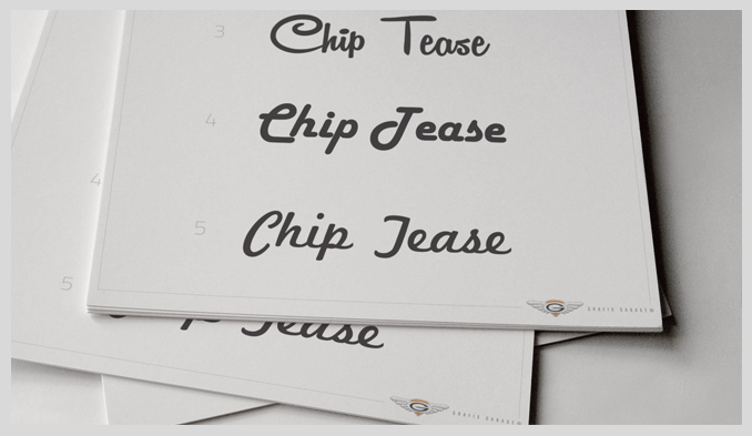
^ Step 1 - We isolated and short listed 15 fonts that we thought depicted the brand, indicating our preferences
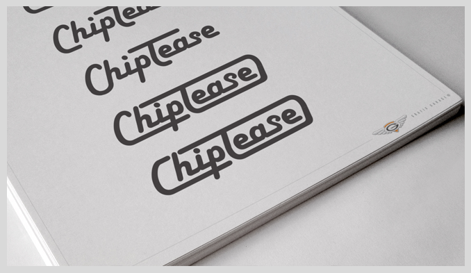
^ Step 2 - We also illustrated how that font could be used and discussed various strengths and weaknesses that they displayed
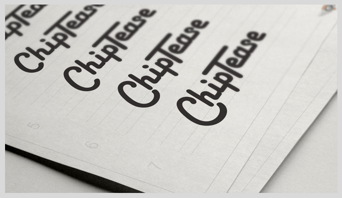
^ Step 3 - Once a preferred font was decided upon, we submitted variations to help the client decide composition
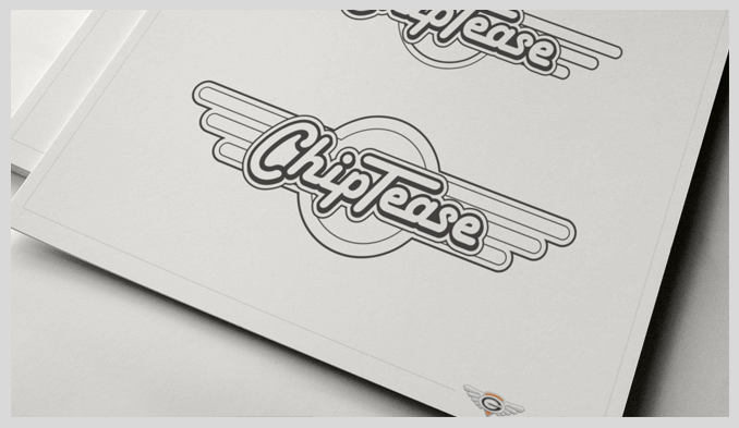
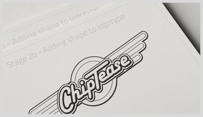
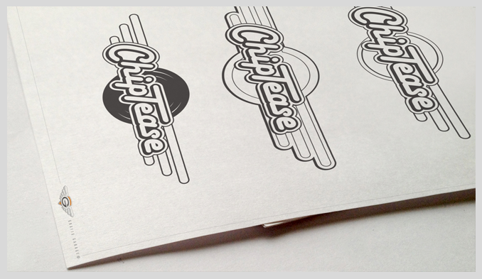
^ Step 4 - To further strengthen the design we showed the client many and varied combinations of shapes and symbols in conjunction with their logotype
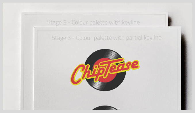
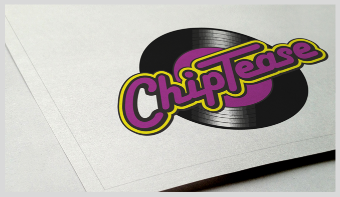
^ Step 5 - Once the client has decided on the final style and design of the logo the last stage is to determine colour palette. Many combinations were provided before reaching a final decision
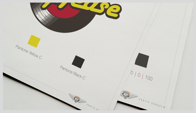
^ Step 6 - The finished logo is rendered and a style guide is produced to assist future reproduction and maintain brand integrity. At this point we create print and digital versions of the logo for reproduction and distribution
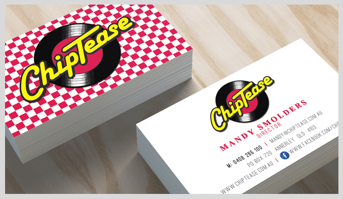
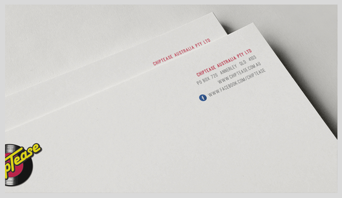
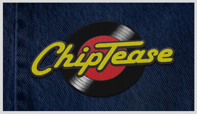
^ Step 7 - The brand collateral is ready to use, stationery including letterhead and business cards were designed incorporating the corporate identity developed during the process
