Postura

Postura

Let's get physio

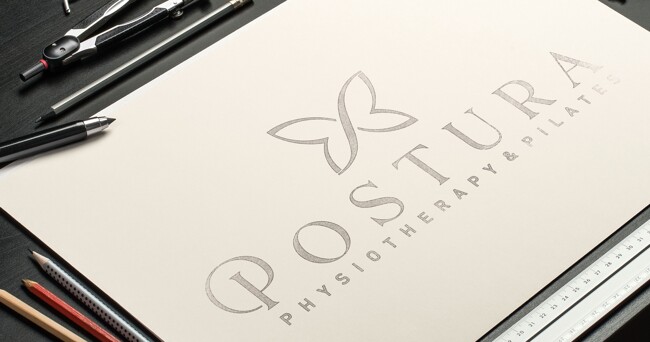
After many years under its previous name “Pulse Physiotherapy” the remaining partner decided it was time to rename the business. Injecting her personal flair and heritage the business was renamed to “Postura”, Portuguese/Brazilian for posture.

This predominantly female focussed business needed an elegant brand solution to reach its intended market whilst still connecting with its core clientele. The emphasis was on appealing to health conscious professionals who understand the importance of flexibility and posture in their everyday life and how that minimises the risk of injury for their ongoing well being.

Services
BRAND DESIGN
CORPORATE IDENTITY
LOGO DESIGN. STYLE GUIDE
SIGNAGE DESIGN
Location
RED HILL, QUEENSLAND
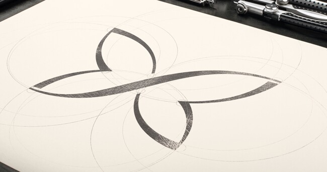
Our client identified heavily with the butterfly as a symbol that represented their ethos of burgeoning growth.

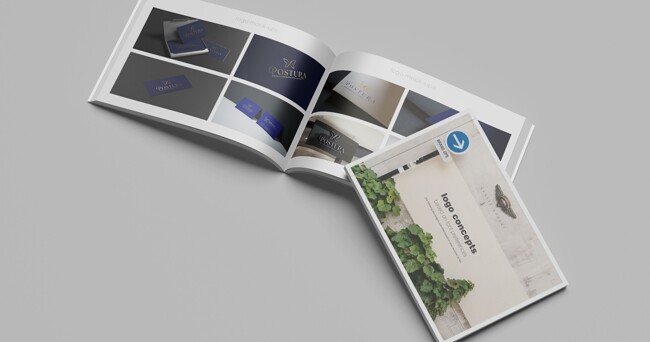
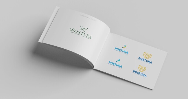
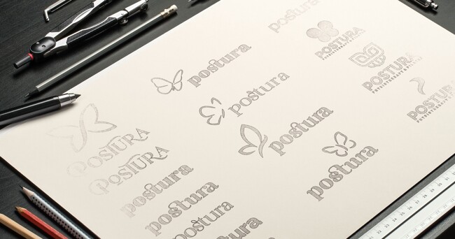
Even with this as a starting point, this project was no walk in the park. Typically when designing a logo and a brand we would present three different concepts and refine our designs from there, not on this occasion however. We were quickly able to determine that a combination of symbol and logotype were required and even with the starting point of a butterfly, several designs were needed to refine the look and feel the client was after.  Several variations were presented before settling on the final design.

As with every project that Grafix Garage undertakes, each component of the logo and brand is painstakingly constructed with every curve and detail scrutinised for its look and flow. The central element of the butterfly mimicking the curvature of the spine for a subtle subliminal connection. The spacing and gaps are carefully measured and checked to allow for maximum printability at any size.

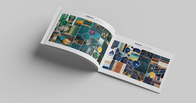
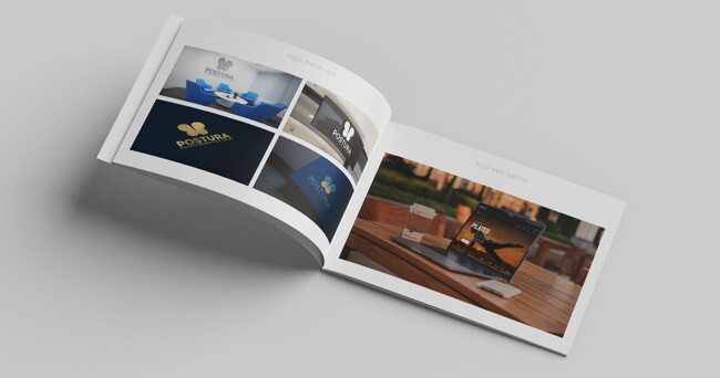
Several versions of the colour palette were presented in the form of mood boards to arrive at the final colour combination which included directions for interior design. As with all of our design projects, visualisation is an important part of the process. Mockups accompany every design decision and are invaluable in helping our clients understand the visual journey.

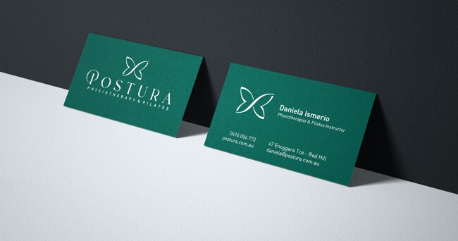
Knowing how the logo will be used is a major part of any design process. In this case we knew it had both digital and print requirements, appearing on everything from uniforms and external signage to their web presence.

If this design gave you butterflies, it might be time to revisit your own. Take a leap of faith and reach out.

Enough about us...

6 / 170 Montague Road, South Brisbane